BACKGROUND
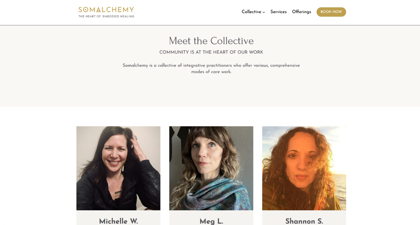
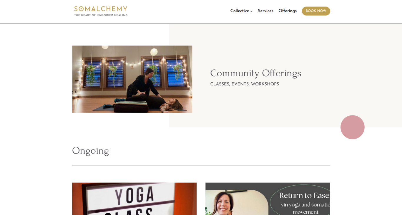
Somalchemy is a collective of integrative practitioners who offer various somatic and holistic approaches to health and well-being. The organization went public in 2021, and I’ve worked closely with the brand every step of the way to develop a complete visual identity system and professional website that’s reflective of their values.
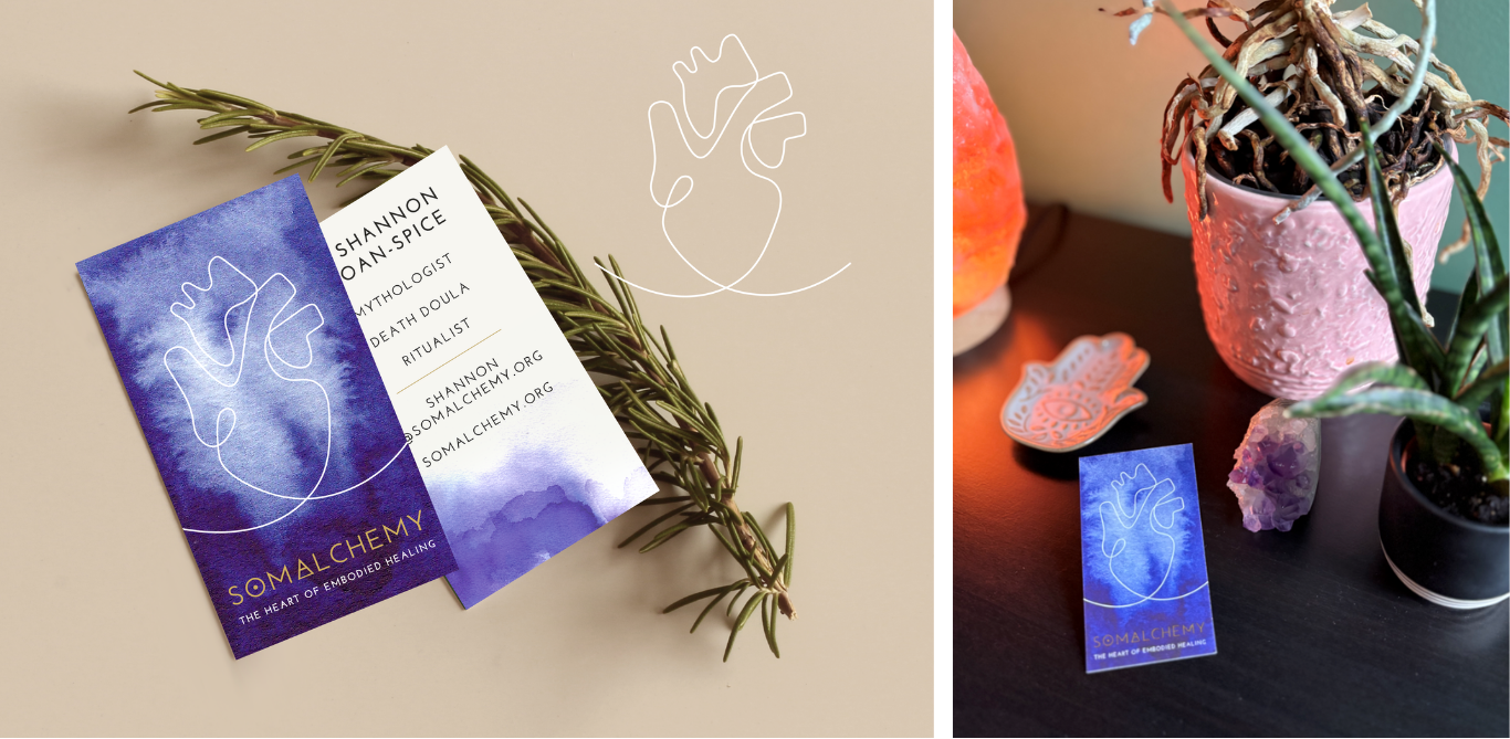
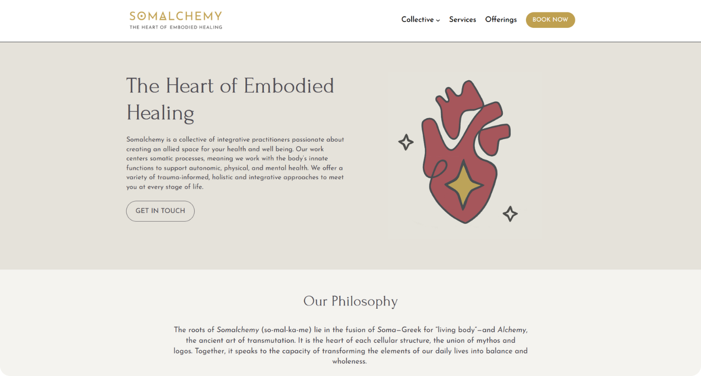
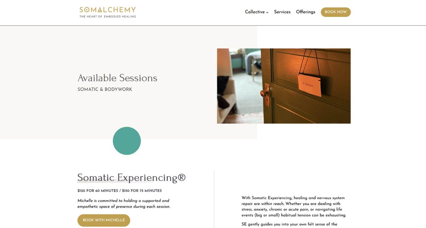
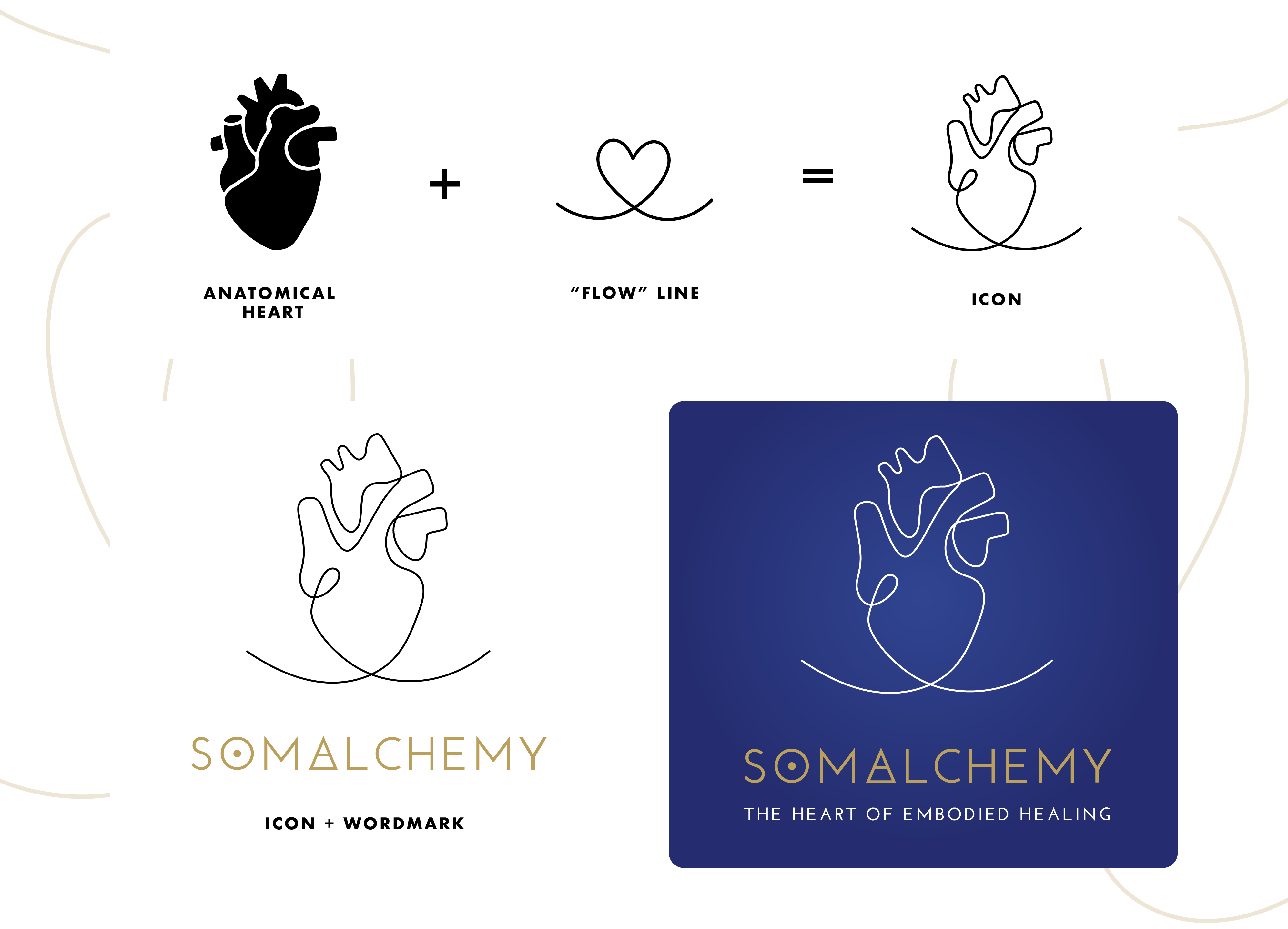
To come up with a meaningful brand identity, we first turned to the roots of the business: “Somalchemy” (so-mal-ka-me) is intended as a fusion between “Soma,” meaning “living body,” and “Alchemy,” meaning “transformation of matter.” I began with these ideas in mind, working closely with the team during the ideation process, before landing on an abstracted, anatomical logo that resembles the human heart. This idea of basic anatomy then nurtured the design of the website—from the simple yet sophisticated layout, to the focus on organic shapes and colors found within the natural world.
ROLE
• Brand Identity
• Ideation
• Illustration
• Logo Development
• Web Design
DELIVERABLES
Brand Identity System & Website
CRAFTING THE BRAND
The team’s primary goal for this brand was to make it feel comfortable and welcoming, but still sophisticated and reliable. This continuously led us back to ‘Mother Nature,’ the original teacher and nurturer, as a source of inspiration.
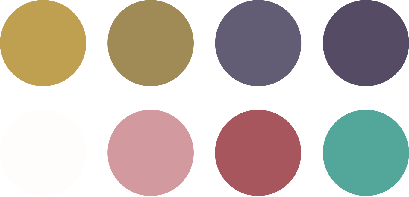
The color palette was taken directly from the warm, rich hues of a summer sunset in the Midwest, where the collective is based.
MAINTAINING A PERSONAL TOUCH

All brand illustrations were drawn by hand, with the intention of humanizing the organization. All brand collateral is united by the heart—Somalchemy is the heart of embodied healing, after all.